We are very satisfied with the work of 4eck Media and are delighted with our fantastic new website. Working with you was a very professional experience and we felt well advised at all times.
Sharp contrasts meet modern experiences.
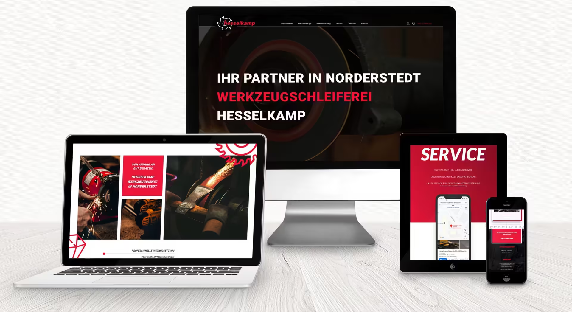
The old website of the Hesselkamp tool grinding shop, which has a long tradition in Norderstedt, Schleswig-Holstein, was somewhat outdated. Our task was to create a modern, clearly structured website. Tools? Grinding? Tradition? A few creative ideas quickly came to mind for a compelling, powerful one-pager that presents the company in a fresh way.
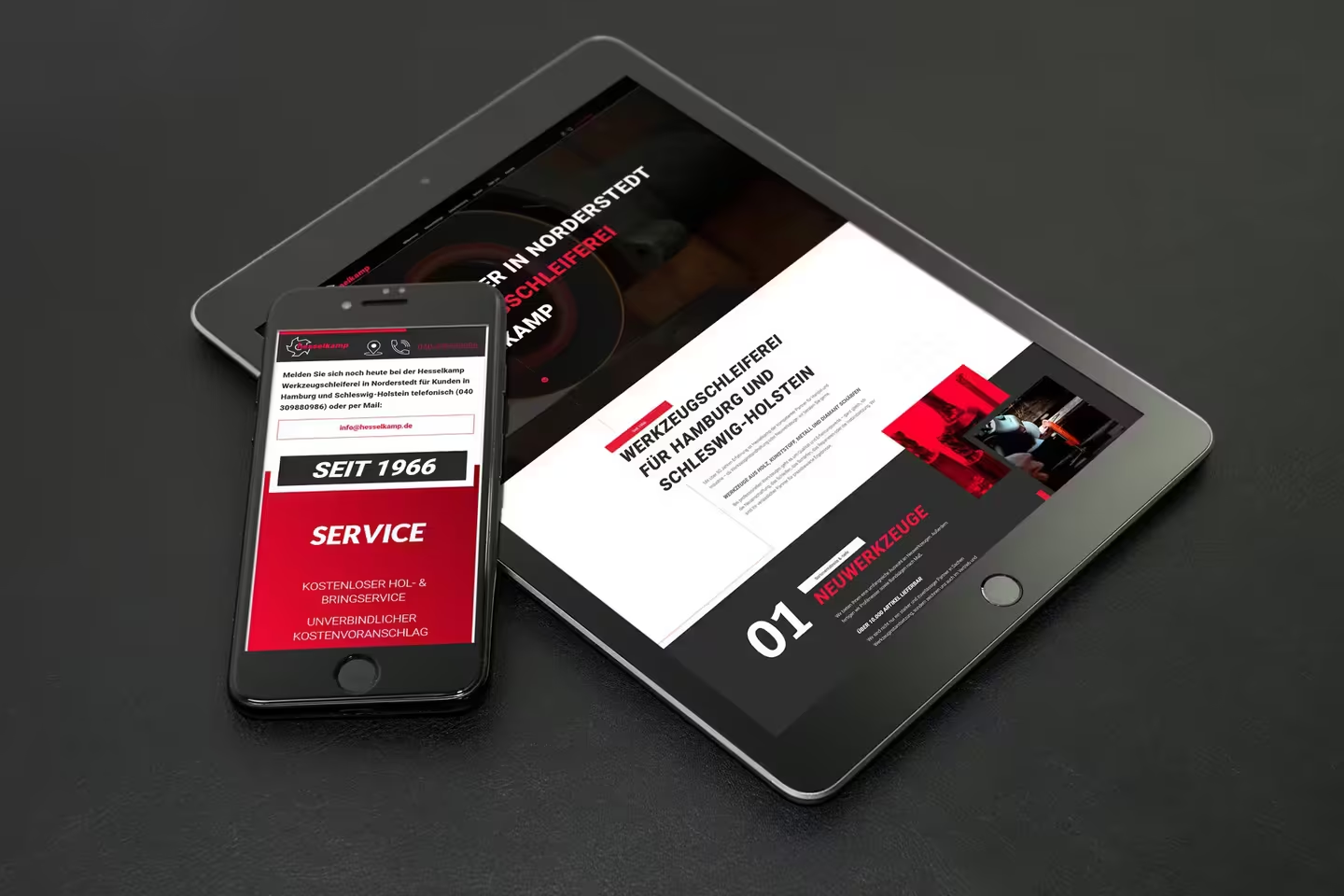
Sharp contrasts meet modern experiences – that was our design philosophy. Modern and sharp in design, functional in experience, the new website perfectly reflects the precision and quality that Hesselkamp stands for.
Contrasting color, typography, and image concept
A design that sparks interest at first glance… The large typographic elements that stretch from top to bottom across the entire landing page are particularly attention-grabbing. pulling, and the color concept of black-and-white images and high-contrast color images with red overlays. Sharp contrasts meet a modern experience – we believe we have wonderfully realized the theme.
Animations as highlights to experience
The visitor is greeted directly with a video loop. A small moving arrow points down to encourage scrolling. The navigation is pinned at the top. The location icon and phone icon, as important call-to-actions, enlarge. Icons fade in from the sides while scrolling. Additionally, there is a button to scroll back to the top at any time. Everything works wonderfully in desktop view and, of course, on mobile. In other words: all cool!
At a glance
- Concept and layout of the fresh <0> tool website as a one-pager in Adobe XD.
- Image research and image optimization
- Implementation and development in HTML5 & CSS3
- Responsive adaptation (mobile optimization)
- Creation of custom icons
- Fine animations such as scroll progress bars and icon animations.


